DashboardHub - When Material Design Meets Real-World Challenges
This was my first serious Material Design project. The DashboardHub team was building an open-source deployment pipeline monitoring platform as a PWA, and I had to create an interface for developers and DevOps engineers - an audience I was still learning to understand. Angular + Material Design seemed like a natural choice for PWA, but I quickly learned that safe solutions sometimes need creative adaptation.
DashboardHub collected information from various sources about deployment processes and displayed everything in one place. For developers, this is critically important information, but explaining it simply was the real challenge - like trying to make deployment pipelines sound interesting at a dinner party.
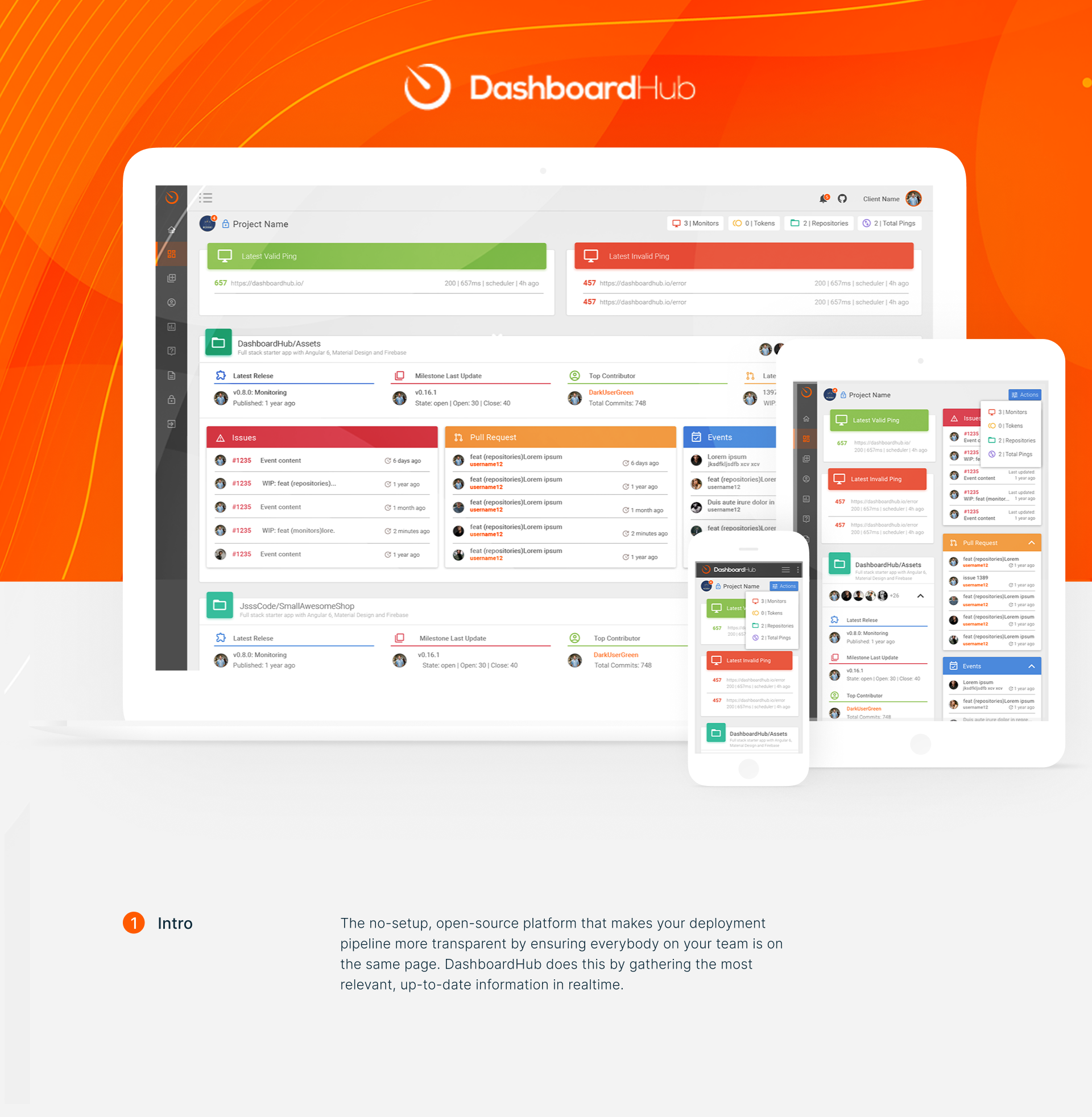
I decided to break from the typical Material flat aesthetic and added a gradient background. The orange gradient became our signature - warm and distinctive, helping the product stand out while showing this wasn't just another gray admin panel. Showing desktop and mobile simultaneously emphasized the PWA nature where users get push notifications about deployment statuses directly on their devices.
Design System - Finding Balance with Brand Expression
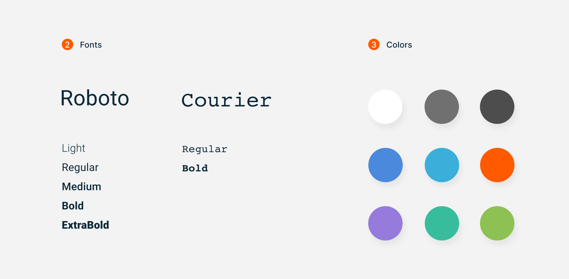
Material Design provided Roboto as the foundation, but developers work with code, URLs, and release versions daily. Adding Courier for technical elements wasn't just aesthetic - it was functional necessity for better readability in data-heavy contexts.
The real design challenge came with colors. The client had a strong brand attachment to their orange logo and naturally wanted to see this reflected throughout the product. Their vision was bold: "Let's make the dashboard orange-themed with colorful blocks for better content distinction."
I understood the marketing logic - in a landscape of predominantly gray developer tools, orange would certainly make the product memorable. However, orange as the primary color created some usability concerns. When your brand color is orange and warning states are also orange, users can lose important contextual cues. Additionally, making every element colorful can actually reduce the impact of truly important information.
Through several collaborative iterations, we found a middle ground that honored the brand while maintaining usability. Orange became our signature accent, critical information retained semantically appropriate colors, and we selectively used color to highlight genuinely important elements rather than everything. This process taught me valuable lessons about client collaboration and finding solutions that serve both brand and user needs.
Dashboard - Information Overload vs. Human Psychology
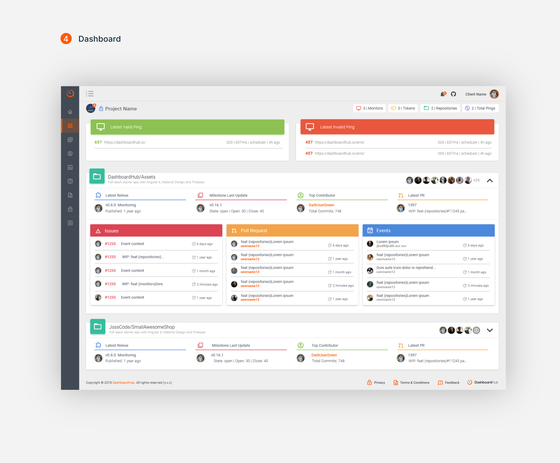
Here I had to become an information architect by force. Developers want to see EVERYTHING simultaneously: environment statuses, release versions, deployment history, active users, issues, pull requests. Classic case of "we want it like competitor's, only better and with blackjack."
Material Cards seemed like an obvious solution, but standard proportions created cathedral-sized interfaces. Had to break Material spacing rules for functional density.
The trickiest part - creating a scanning pattern. Developers first look for problems: failed deployments, security issues, broken builds. All critical information went to the top with red and orange accents. "Panic mode" information at the top, "all is well" statistics at the bottom. Simple as an emergency room.
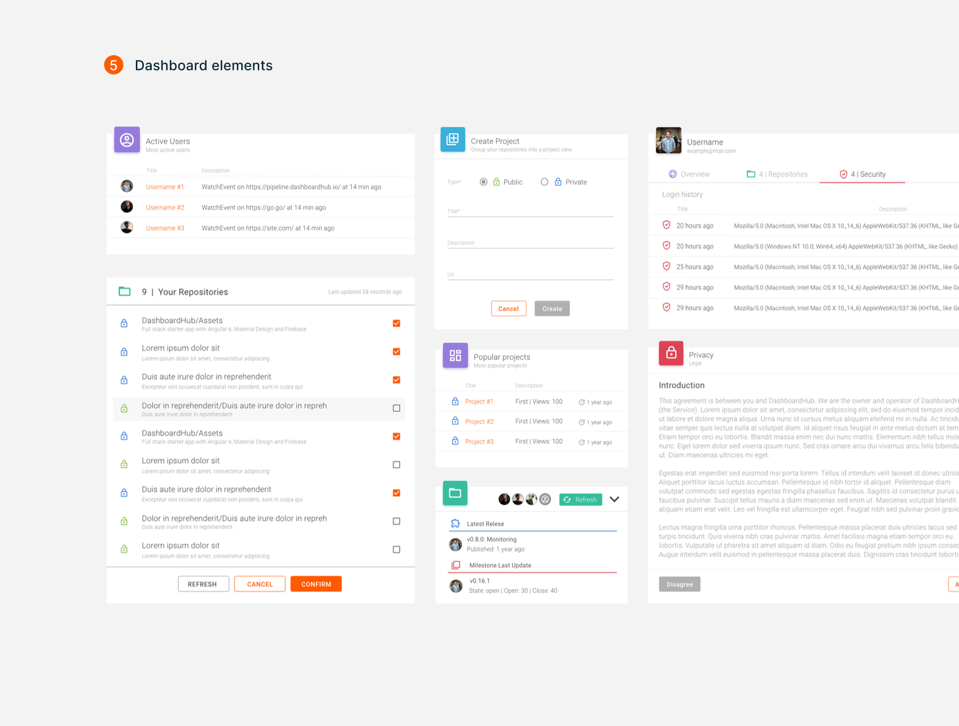
Classic first Material project dilemma: take ready-made or customize beyond recognition? Client wanted "personalized experience" for project creation (read: not like everyone else), but Material Dialog has its own ideas about personalization.
Most painful - data tables. Client: "We want to show all columns at once!" Material Table: "Are we kidding about responsive design?" Had to make hybrid - Material as foundation, adding custom sorting, filtering, and expandable rows. Compromise as art form.
User activity widget became a diplomatic victory - combined Material List patterns with custom git visualization. Learned the main thing: Material works best when you use its strengths and quietly add your own where it falls short.
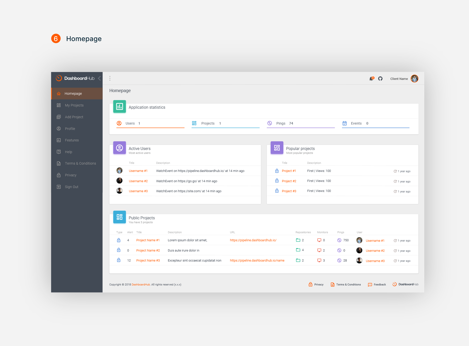
Homepage became a testing ground for my understanding of Material principles in functional context. Here I needed to combine dashboard functionality with a welcoming first experience for new users.
I used Material elevation principles to create information hierarchy - most important metrics got highest cards, secondary information stayed on lower elevation. Application statistics were shown through custom visualization on top of Material foundation, but interaction patterns remained familiar to Material ecosystem users.
Hardest part was balancing informativeness with approachability. Dashboards are naturally information-dense, but homepage should remain welcoming for new users. I solved this through progressive disclosure - main information visible immediately, but detailed data accessible through expand interactions.
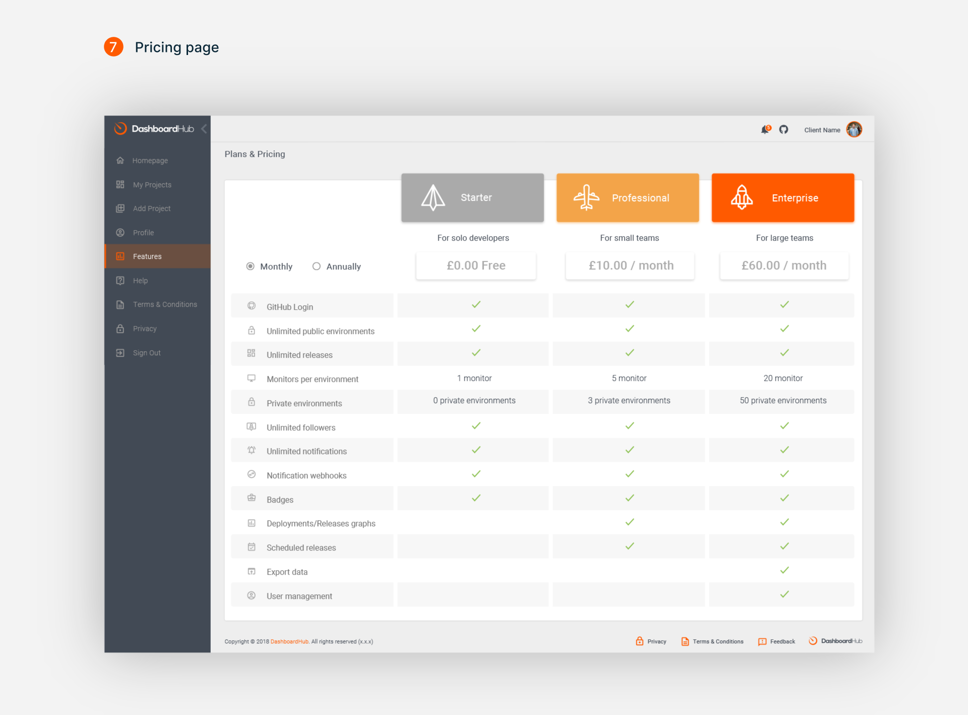
Material Design was rarely used for pricing pages, and I understood why - its principles work better for functional interfaces than marketing content. But I needed to create a pricing page that felt like part of the product, not a separate landing page.
I decided to apply Material elevation principles to create hierarchy between pricing plans. Enterprise plan got the highest elevation and orange accent, Professional got medium elevation with blue accent, Starter remained flat with gray styling. This created visual hierarchy without using typical pricing page tricks like "Most Popular" badges.
Feature comparison table became the biggest challenge - Material doesn't have established patterns for this content type. Had to create a custom solution while maintaining Material typography scale and color principles.
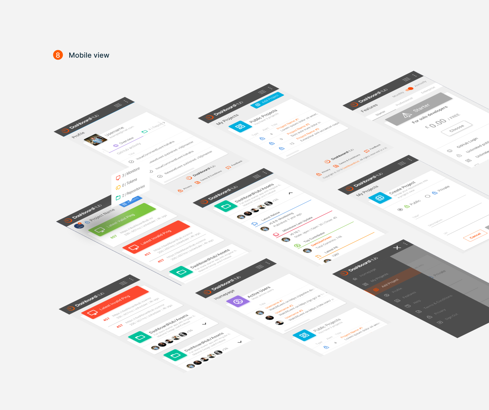
PWA meant mobile wasn't optional - it's a core requirement. Developers get push notifications at 3 AM: "Production is down!" and need to diagnose problems from their phones while commuting to work.
Most challenging part - tables. Desktop dashboard was packed with data tables, but horizontal scroll on mobile is a path to madness. Standard solutions didn't work for critical information.
Eureka moment: each table row transformed into an expandable card. Key info (project name, status, last update) on card header, detailed data in expandable content. No horizontal scroll was harmed, all information accessible. Material gave me navigation patterns, but table-to-card transformation was pure creativity plus a couple sleepless nights.
PWA superpower: offline access to cached data and push notifications. When production crashes at 3 AM, you get a notification, open the app, and everything necessary is already there. Almost like magic, just with code.
______________
Results and Learning
The project was successful - DashboardHub is still live at dashboardhub.io, has an active open-source community, and is used by real development teams. But the most valuable part was personal learning.
I understood that design systems aren't limitations, but foundations for creativity. Material Design gave me structure for decision-making but didn't free me from thinking about specific user needs. Each deviation from guidelines needs justification, but sometimes such deviations are necessary to create truly functional products.
This project also taught me to work with unfamiliar audiences. Developers have specific needs and expectations from interfaces, and understanding these needs came only through iterative design and team communication.
Most importantly - I learned to balance consistency with innovation. Material Design provided consistency, but innovation came from understanding real user problems and being ready to adapt the system to these problems.
______________
Looking back today, I see this project as an important step in understanding that great design doesn't come from blindly following guidelines, but from thoughtful adaptation of these guidelines to real human needs.